case study
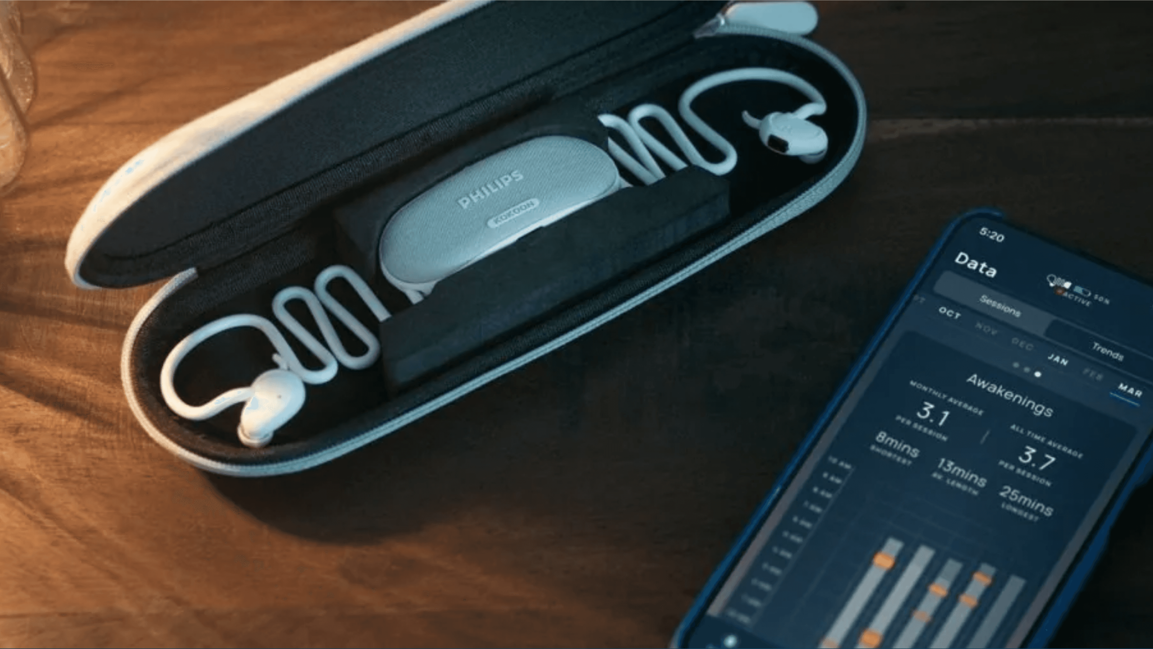
Kokoon offer a connected device (headphones + app) sleep improvement experience, for anyone suffering from sleep issues or those who simply want to track and improve their sleep.
A complete redesign of the Kokoon app’s data visualisation feature was initiated after new analytics showed that our original assumptions about user behaviour were incorrect. The existing UI was unexciting and failed to communicate key insights effectively. This case study outlines how I led a redesign to improve clarity, usability, and accessibility.
my role
UX Design (Lead)
User Interface Design
timeline
tools
Figma
Miro
Wireframe CC
Problem
Compared to many competitors & comparators in the health/wellbeing & fitness market, Kokoon's data view offering was basic & rather lacking in visual interest. User's expectations were higher, leading to a poor App Store rating and disgruntled customers - having just purchased the paired device sleep headphones for which this companion app is used exclusively with.
MVP Data View


Research, strategize and design a much improved sleep data viewing experience, with a focus on increasing app retention rates by c.33% on the previous MVP, while boosting our app store rating from 2.3 to 4+
Analysed user behaviour and session recordings, identifying pain points in the existing visual interface.
Conducted a survey and user interviews with frequent users to gather qualitative feedback.
Benchmarked against data visualisation patterns in health/fitness and finance apps.
User Interviews


Worked alongside a UI Designer for this first redesign, bringing more dynamic functionality to charts & visual elements.
Incorporated a chronotype survey into the app to funnel user types and tailor suggested insights based on their outcome: Owl, Lark, or Dove, each with a designated colour.
Kokoon's website & marketing material was all being rebranded, so we refreshed the colour palette as part of this major app project and started to build out a style guide.


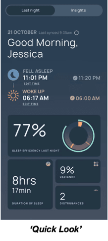
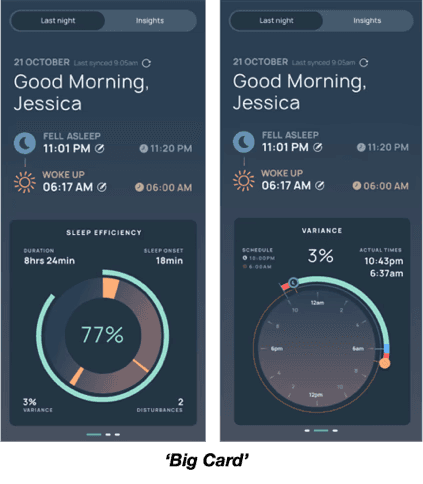
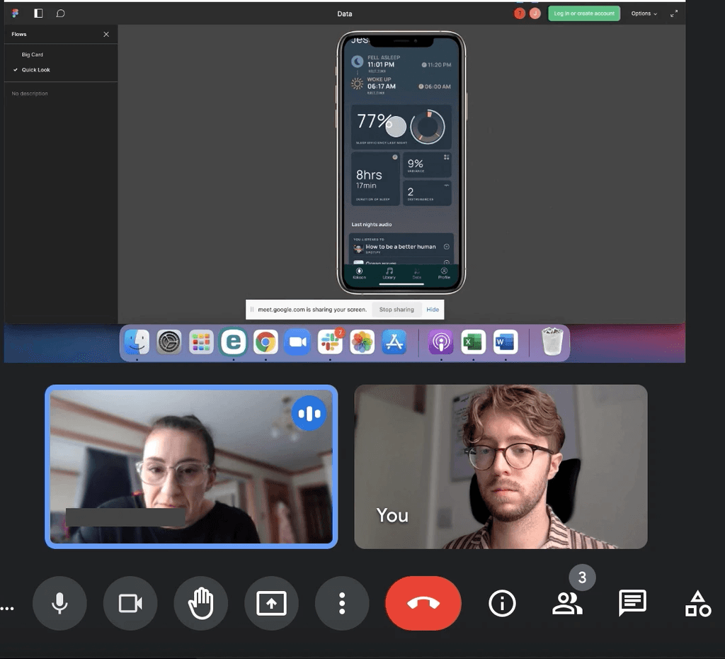
Ran usability tests using Figma present view by screen sharing on video calls, targeting interpretation speed and comprehension. I tested 2 slightly different concepts for the 'Last night' sessions view (Quick look' & 'Big Card') on 7 participants.
User testing

User research revealed our charts and graphs were difficult to interpret due to cluttered design and poor colour contrast in places. This made it challenging for users to extract meaningful information, especially those with visual impairments. Additionally, the information architecture lacked hierarchy and scannability.
key insights
Graphs lacking context, without key/legend to help users determine what they are seeing.
The majority of participants commented on not understanding exactly what they were looking at and asked questions directly related to elements/colours of graphs (x4 participants).
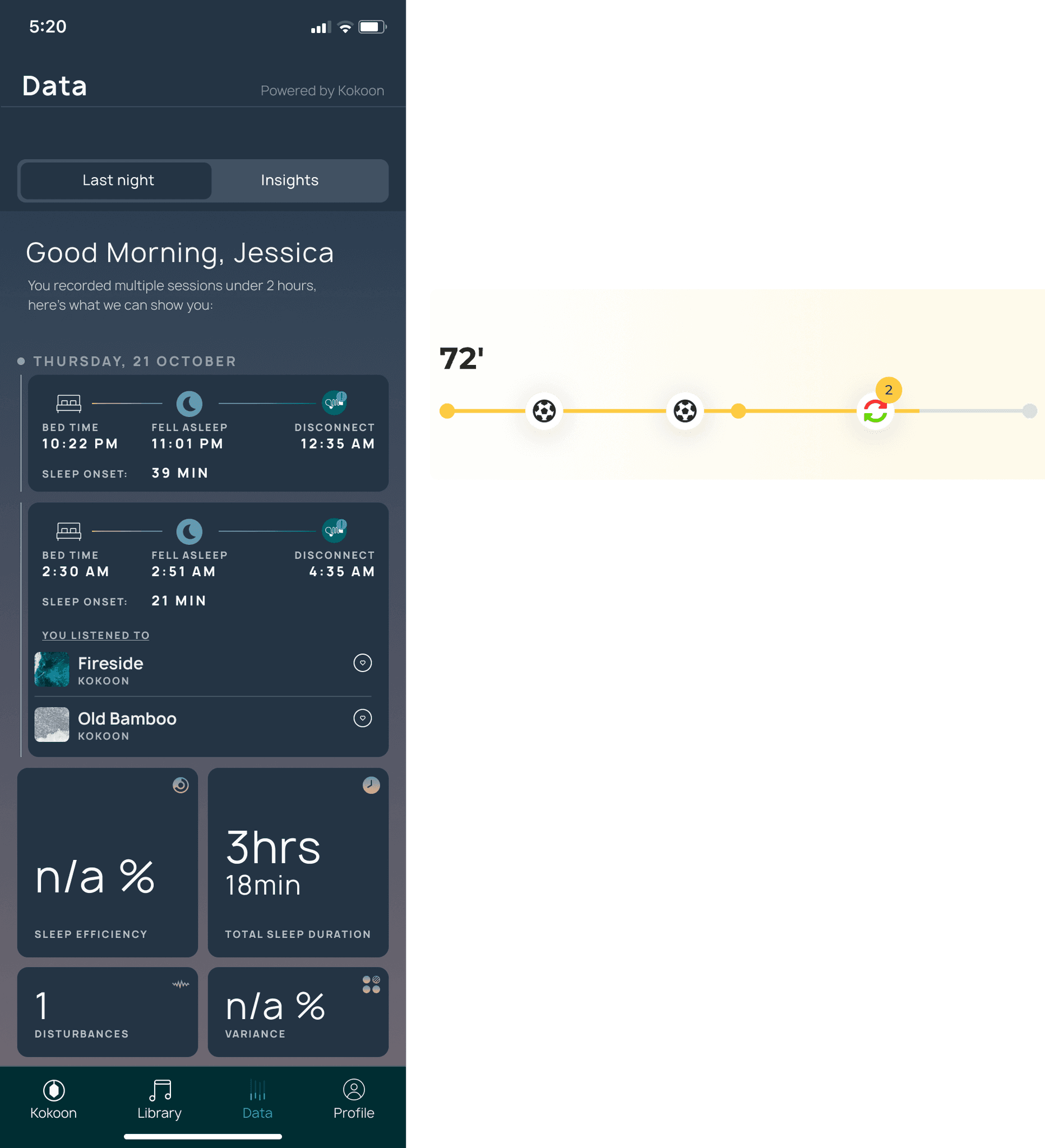
Participants often used their best-guess at what they were seeing and went with it, sometimes misinterpreting the data. For example 2 participants believed ‘variance’ to be a measure from the previous night’s sleep.
It became clear that some users are more visual than others, whereas some are happier seeing clear numbers. We need to consider the mix of visuals and text.
Users still want to see stages of sleep cycles - expectation from other apps.
When asking participants if there was anything missing from the new data prototypes, or anything specific they would like to see, 50% immediately mentioned sleep stages, particularly REM & Deep Sleep. The common understanding being that a sleep stage determines how they feel upon waking and are curious to see if the app ‘agrees’ or not, or whether they can improve on REM/Deep sleep levels through use of Kokoon.
At this point, since launching the MVP we now also had a lot more real user analytics in hand. We realised our hypothesis of what the typical user experience looked like was wrong. Rather than all-night sleep tracking, our product was more of an intervention for struggling sleepers. This meant different data metrics were key for users, along with what we could show consistently and reliably for all 'sleep session' lengths based on algorythm & system constraints.
Sketched multiple layout options focusing on clarity and visual hierarchy.
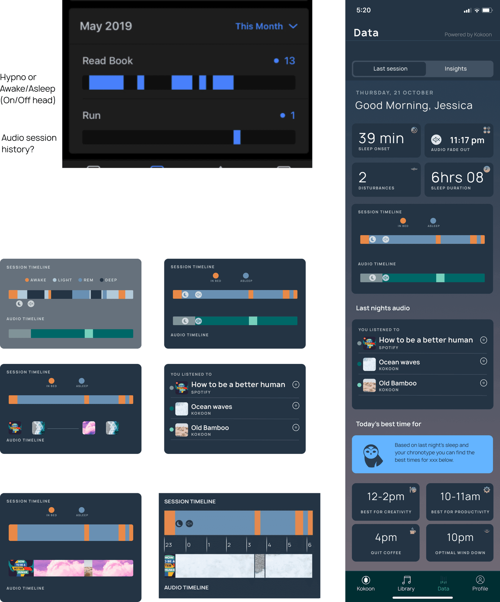
Created several different hypnogram designs to show sleep cycle stages, crucially needing to adapt for both long sessions and the algorythm-limited short sessions.
Identified overused UI patterns and removed redundant visual elements.
Proposed contextual tips and light affordances to help users interpret charts.
timeline ideas
creative hypnogram

how might we highlight our audio usp?
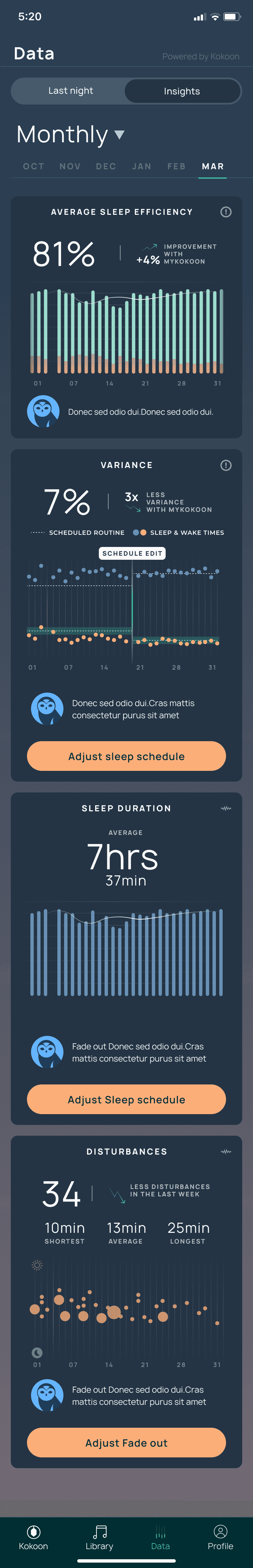
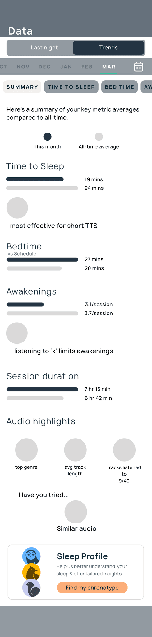
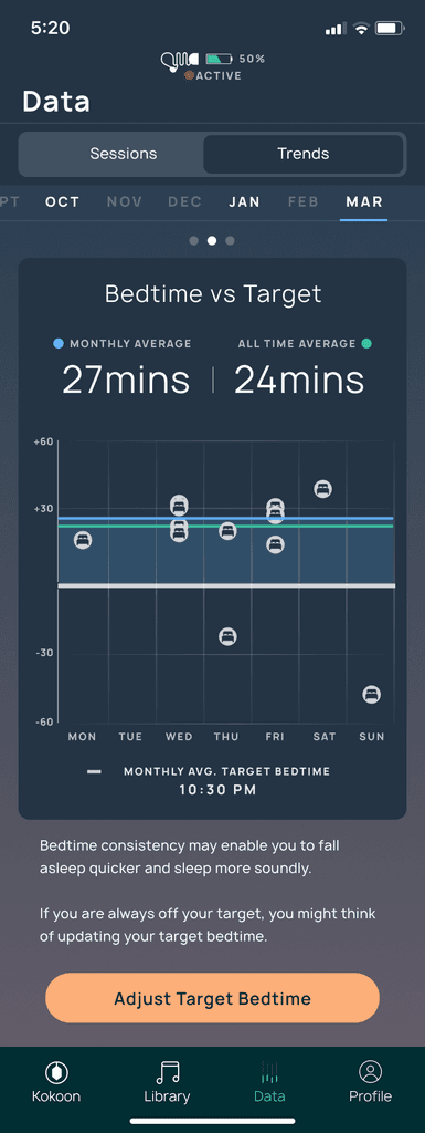
reimagined 'insights' tab as 'trends'. showing data over time


Created mid-fidelity wireframes and high-fidelity UI mockups in Figma.
Prototyped interactive chart components, testing different graph types.
For 'Trends', decided to go with overlapping session data per week day on 'Time to Sleep' & 'Awakenings'. This better suited all user frequencies and meant sporadic users wouldn't be faced with starkly empty month-view charts.
Iterated based on feedback from users, including those with colour blindness and low vision.
Partnered with a UI Designer to build a new, accessible colour palette & style guide.


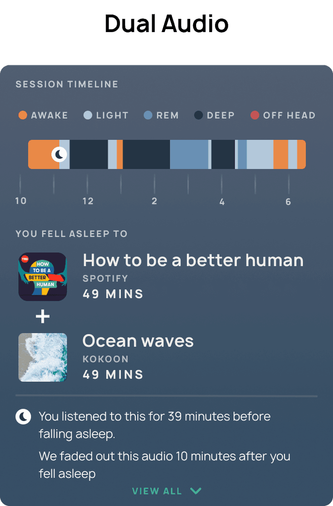
Now that we knew a large chunk of users (c. 50%) were reaching for their headphones & app as an intervention for getting to sleep when they had trouble, and not neccessarily using our product all night, we needed to be able to show a hypnogram that was always useful for both long and short sessions, providing as much detail as we could within our system constraints, whilst always being a consistent UI display as to not confuse users.
Under a certain session length threshold, our headphone sensors & sleep algorithm could only accurately predict two sleep states: Awake or Asleep. As we know sleep cycles typically start with a period of light sleep, we were able to flag the first sleep period as 'Light'. We were also always able to know if the headphones were being worn or not, adding a third state for short sessions (5th for longer sessions) - 'Off Head'.
I came up with a design that would dynamically change based on the user's session length, whilst retaining enough consistent UI elements so that the user would always be familiar with what they were seeing.
The hypnogram bar itself would always be the full width of the tile, while the time interval markers & labels adapted to best fit the session length.
I used this 'Session Timeline' tile to link audio insights we were able to capture against the sleep session.


Ran further usability tests using Figma present view on video calls.
Decided to hold back the implementation of the 'Trends > Summary' view for now.
Tweaked key and legend placements, spacing, and contrast.
Consolidated charts & layouts into a new design system component library.


Redesigned graphs now prioritise key metrics with visual clarity.
Used consistent, accessible colour themes.
Streamlined information hierarchy.
45% increase in user interaction with charts
60% drop in support tickets related to data confusion
Positive feedback from visually impaired users
Design elements fed into an updated style guide
App Store rating improved from 2.3 to 4.1 based on this much improved data vis and bug fixing.
This project was a turning point in how I approached accessible design. I learned the importance of validating early assumptions and letting real user data drive redesign decisions. In future, I would invest even more time upfront in defining success metrics collaboratively with the product team.


Want to know more about me or my previous projects? Reach out below:
Contact me